0

Lunch and a NYFW Conundrum

2.06.2014

_IGP2662

_IGP2687
Vintage flannel, Max Mara sweater, vintage Jones NY skirt, Cheap Monday Taylor vest, Jeffrey Campbell Perfection boots, Rebecca Minkoff Hudson mini bag (it's crazy awesome in red too), Quay Bonny sunglasses, De Lune x By Boe Third Eye Cuff, Vanessa Mooney hand bracelet, Vera Meat rings


It's Fashion Week and I'm kind of avoiding it. 
Kind of.
Sorta.

Here's the thing with being a (mostly personal style) blogger during Fashion Week: people either love you or hate you because of what you do. You're either seen as a narcissistic amateur or a creative influencer with a cool, creative brain (with a lot of page views which = coverage, I get it though, it serves an important purpose). Now, I love Fashion Week because I get to meet really impressive and sincerely creative people while viewing collections designed by friends and colleagues, but on the other hand, it's an absolute zoo and the fact that seasoned industry folk might resent my presence gives me anxiety.

I also have classes I need to be in, so there's that old chestnut.

Of the shows that don't interfere with classtime, I have a couple that I'll head out to like Suno, Timo Weiland, Lulu Frost, and Alice & Olivia, but other than that, although I'm happy to get invites, I'd rather see better details on Style.com instead of getting an elbow in the ribs by an overly dressed magazine intern at Milk Studios. It's also REALLY cold outside right now and I'm the worst with dressing for travel and comfort.

Speaking of which, I wore this stuff for lunch in the neighborhood. The boots are doable in the snow with the right socks and weatherproofing, and this sweater saves my life on the regular; I think I've worn it at least once pretty much every week in January. And this vest, oh, this vest. Cheap Monday makes really awesome pieces that play with proportion and material, so this denim vest is great because it's so oversized and fun to layer.

Anywhose, It's an exciting time in the city, I just gotta be on my A-game before graduating. 

Feel Free to Follow: Facebook • Bloglovin' • Twitter 

2

Letters Between Yoshie Tominaga and Patti Smith

2.03.2014


Aren't these beautiful?
This look into the correspondences between photographer Yoshie Tominaga and Patti Smith has been thoughtfully documented in Tominaga's book The Shepherd. There is a lot I could say about why I love these scans; for one thing, the book as a whole chronicles the photographer's early documentation of designer Jun Takahashi's career with Under Cover along with snippets of her own life, and the photographs between Patti and Yoshie are just as quietly profound as the letters that they accompany on their pages. In these letters, there are moments of sadness- Yoshie starts some with apologies, Patti falls ill, Yoshie finds herself emotional after one of Patti's poetry readings, but all in all, there is the assurance that there will be a letter in the mail, some correspondence from a missed friend, a little compassion felt within and around their handwriting. 

Both artists are no strangers to heartbreak, loss and a commingling with the darker recesses of life. Some live in perpetual desaturation, and gathering entire universes onto a page through a poem, a  stanza, a drawing, it puts your world in front of you. These letters, accompanied by both the friends' photographs, indeed seem melancholy, but their truthfulness and warmth still come through as fragments of the other side.

Don't you find that both their handwriting looks similar too? I can't help but love that, it's kind of charming and reflects that they have a lot in common intellectually. I'm working on writing letters again since I've made a few friends overseas, I did it more as a kid, and now I'm even asking frineds in Brooklyn if I can write letters to them. Facebook and social media in general have made me lazy, rendering my friendships to simply occupy my computer and phone from time to time. The presence of someone's voice and thoughts coming through their personal handwriting is a really powerful experience, and I think we tend to forget that, especially when now it's more often confined to a card and not an actual letter, as letter-writing has become somewhat obsolete. I get it, I really do, but why not engage in such an act now that it has become a truly special ritual?


Feel Free to Follow: Facebook • Bloglovin' • Twitter 

3

Fringes

2.01.2014

_IGP2632

_IGP2618

_IGP2647

_IGP2646

_IGP2643
Free People chiffon button down, Stylemint shirt, For Cynthia plaid jacket, Mango coat, Rag & Bone pants, Sigerson Morrison boots, Leifsdottir bag

Why do I drag my decently expensive bags on the ground like an aloof child? Why do I usually fail to keep my possessions in a respectable condition? 

When I was in high school, I was encouraged (no, actually TOLD- we were graded on our "markings", as they were called) to completely destroy my books with marks and notes in the margins so that I would "read actively", a way to make sure I was paying attention to the story at hand. I've sort of carried this "destroy the things you love" practice throughout my life and my stuff, so by wearing the hell out of my belongings, I prove to myself that I love them.

So out of what I'm wearing here, you probably can't tell that my pants have a small "V" shaped split at the back band at the waist, the taps of my boots have disintegrated with wear, and the last two rows of buttons on this coat have been lost to the street traffic of the city, but whatever, I'll wear them 'till I can't anymore. I'll alsosay that 40% of those choices to keep these things from falling apart has to do with sheer laziness and lack of money, but that also adds to a romatic appeal, doncha think?
The Mona Lisa is falling apart.
...Not that a coat from Mango is fine art.

A mix of prints and textures can keep your mind awake and more focused upon a glance; the mélange here is something I've been trying to incorporate in my outfits as I get ready for class. Maybe after I get my homework done I'll finally make my way down to a tailor, but what can I say, I'm a sucker for novelty.

Feel Free to Follow: Facebook • Bloglovin' • Twitter 

1

How Far They've Come: Warby Parker

1.31.2014

_IGP2608

IMG_6542

_IGP1959

_IGP1944

_IGP2578

_IGP2603

I was there when Warby Parker was just a website and a small hopefully bright office/showroom off Union Square. I had just started college, and I was living in this perpetual, almost naïve excitement that would show its head at the moment I found myself shaking a hand or watching another person's eyes light up as they spoke about art or their dinner. I was ready to learn about anything and everything, and  nothing had impressed me like my first visit to the Warby Parker showroom.

When I first met Neil Blumenthal, one of the co-founders of Warby, the line was pretty much brand spankin' new. He had emailed me to invite me to the showroom so I could learn about their system of buy one/donate one while also learning about their design process. I had never learned about eyewear as a facet of design, even though I've worn a pair since 3rd grade, so I figured I'd get an education. The showroom had their 27 frames and a monocle dotted amongst books and blonde pine shelves, arranged as if a child had been playing pretend with them and had gotten up to attend to their name being called, I was charmed immediately. The glasses looked expensive yet approachable in their casual arrangement. I would carefully pick up each frame and observe the bright afternoon light shine through the acetate and render each pair into a jewel. Neil went on to show me about how egregiously marked up commercial frames are, and at that point, Oliver Peoples was really the only name that would come to mind when I  thought about vintage-inspired frames while these guys managed to create the same damn thing for less and still donate a pair for every one sold, to someone in need.

I think about that day almost every time I visit their new showroom or one of their two flagship stores here in the city. They're all big, bright and beautiful, and I am so proud of these guys for pretty much changing the game while churning out new collections every season with an immense showing of integrity.

I tweeted about their Spring 2014 collection and their collaboration with Leith Clark (which totally took my breath away, I have these for school), and I came in yesterday intent on photographing that stuff. What I learned is that in the excitement of launching all these great new things for the new year, their incredible Palm Canyon Collection was pretty much glazed over and barely talked about, but lemme tell ya, I intend on talking about it because it was all so damn cool to see and learn about. Y'all don't even know.

So first off, scroll back up and look at that first photograph of the sunglasses I'm holding. Did you notice the subtle striped white marbled insets at the corners of the frames? This collection is all in the details, and the details start with the acetates themselves, which took a year to perfect. Now, acetate is made in layers of pigmented, plant-based cellulose plastic, and getting the right grain or the right dispersion of pigments and shapes is incredibly difficult because one has to deal with different temperatures and mixing processes- all done by hand, mind you.

So this collection, as you might be able to tell from its name, is inspired by the beach as a winter getaway, but through the lens (sorry, I had to) of the 1950's. Think Frank Sinatra and the Rat Pack. The acetates resemble wind-swept beaches and the clear blue skies against them. I've always been drawn to tortoiseshell glasses, buttons and combs- anything made of it, really, so the use of that look in this collection hits me right in the comfort zone as well. Tortoiseshell, although cruel in its obtainment, was a lovely precursor to plastic, and that presence of history always gets me. But it's the stripes just at the corners of the frame that make this collection sing for me. Each frame has them, and they're so much more beautifully subtle than the stroke of a brand name plastered all over the side, don't you think? The stripes serve as a reminder of their crafted-ness, of their classic appeal. I'm still geeking out over it all, and I intend on getting my hands on a pair once my damn paycheck comes through. Until then, I'm admiring the photos.

Feel Free to Follow: Facebook • Bloglovin' • Twitter 

1

The Westerner

1.27.2014


_IGP2555

_IGP2553
Vintage shirt and skort, Asos Seesaw shoes, Preston & Olivia wide brim fedora

Hello and welcome to another glimpse into my childish existence.
Sometimes I feel like an embarrassing walking collection of clichés, but I'd be lying if I said I didn't feel comfortable in a retro wannabe's clothes from time to time.

Ribbon-tie collars translate in one of two ways for me: it's either Edwardian or something out of the American South. I don't really "do" the whole sailor/child thing with a tied collar, or at least I try not to, and to avoid that I'll keep the ribbon long and thin, almost like a spider leg. I'll tie a ribbon around this shirt since I enjoy how it looks against the black piping.

Feel Free to Follow: Facebook • Bloglovin' • Twitter 

2

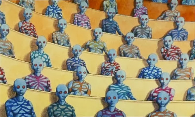
Sunday Cinema: Fantastic Planet/La Planète Sauvage

1.26.2014


My parents took me to see this movie when I was really little- like, so little I had a hard time keeping up with the subtitles. We went to the IFC theater in downtown Manhattan, a theater that still shows absolutely lovely 35mm screenings of older films, and this was one hell of a trip for a middle schooler. To be honest, it scared the living crap out of me, I left that theater clutching my mom's hand tightly, terrified and in need of a giant pretzel.

 It took a revisiting of the film when I was 12 or so for me to really get it. This is juuuuuust when I started learning about surrealism 1. because I was wading in the adolescent soup of that teenage precursor to true self-discovery and 2. because I was too afraid to actually try drugs and get it over with. I've counted Roland Topor, who designed this film, as one of my favorite filmmakers since that intial rediscovery because, if anthing, this film just proves his genius.

Here's an incredibly roughly hewn summary of the film: The story takes place in another world, a world where humans are vastly subservient to humanoid alien beings called Traags. On the Traag planet (which is crawling with fabulous plant and animal life á la Hieronymus Bosch), humans or "oms" are treated as pets or vermin by the Traags, depending on which have been domesticated. The film follows Terr (a play on the French word Terre, meaning "earth"), a human who is raised as a pet by a well-to-do Traag child. As the film goes on, Terr breaks with his domesticated life and returns to his "roots" as a human being after becoming educated through a Traag learning device.

Two sensory things about this movie kick my ass:
1. It was HAND DRAWN. Damn film took 5 years to make, although that also had to do with the filmmaking process getting interrupted by the then-Sovet-occupied Czech government.
2. The music is absolutely incredible. Composed by Alain Goraguer, it's spooky and sexy in all the right ways: a jazz take on sci-fi. I bought the soundtrack on vinyl a few months ago and I play it when I want my environment to feel kinda syrupy and mysterious, like I'm unaware that something is hiding behind a corner.

Planet is one of those films where you need to sit down in a dark room and just let it happen, so go:


De Lune All rights reserved © Blog Milk Powered by Blogger